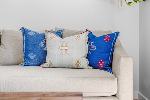
Photo by SHOP SLO® on Unsplash
The Pantone Color Institute has a certain knack. The design company gets a feel for the mood of the year to come, and shapes design trends to match it.
It takes cues from new kinds of materials we use. It considers our social media platforms, upcoming sports events and the sights and sounds that receive international attention. Pantone has selected a color each year for more than 20 years.
For the Start of a New Decade, Pantone Picked Classic Blue
Classic Blue has a timeless and universal appeal. It's a shade of azure that brings to mind a calm, expansive marine horizon or an afternoon sky. Or perhaps bright tiles, crafted by artisans of Mediterranean and semi-tropical climes.
Classic Blue is a primary color with an approachable feel. It has a reassuring presence. That's exactly what Pantone was going for in 2020.
The 2020 Color of the Year Is Refreshing Yet Traditional
Beautiful interior touches in Classic Blue evoke calm and connection, and a sense of the enduring as we pass the 2020 milestone.
Silver and white accents make blue feel clean and attractive, simple yet elegant. Blue brings a sense of peace, clarity and tranquility to a home, fostering relaxed interactions.
No matter whether you avoid or embrace smart home technology, your can create space in your home for the "true blue" we trust.
Especially If You're Selling in 2020, Classic Blue Is Perfect for Adding Timely Flair
Think gentle off-white for bathroom wall sconces or a sink or tub, framed by blue-and-white mosaic tiles.
Imagine a blue wall setting off a bright, polished-nickel kitchen faucet. Kitchen border tiles or mosaic tile flooring in blues, whites and golds evoke the long sunny days of a youthful summer.
You Don't Need to Spend a Lot on Renovations
Classic Blue makes for striking accents even in small touches. It might inspire your choice of bowls to place atop a crisp, white kitchen shelf. Use blue ceramic coasters on a white, black or gold table. Or paint the door in Classic Blue, adding bright contrast to the entryway against a white exterior.
In an era of conflicting ideas and rapid changes, blue brings a sense of dependability that naturally pleases guests and puts home buyers at ease.
Choose Classic Hues to Sell Your Home This Year
When Pantone chooses its annual Color of the Year, a variety of industries showcase that hue: interior decorating, travel, filmmaking, manufacturing, marketing, packaging and graphic design. Tap into the mood of today when thinking about accents and updates.
Ready to get your home looking great for selling this year? Contact us for more tips!
About the Author

